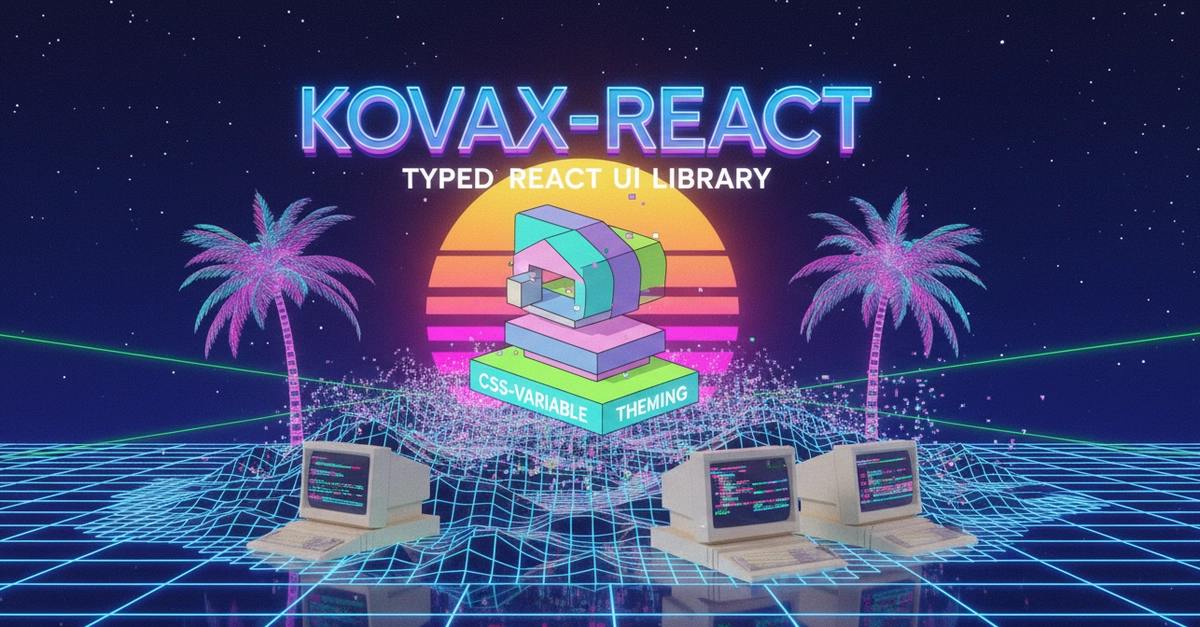
Seventy percent of developers report feeling overwhelmed by the complexity of modern frontend toolchains. A stat that feels about right, frankly. Now, a project called kovax-react is trying to offer a sliver of sanity. It just shipped version 0.5. It’s small. It’s typed. It’s supposed to give you layout primitives, forms, overlays, tables, and design tokens without yanking in an entire framework you don’t need.
This is, apparently, the promised land. Or at least, a decent rest stop on the highway to it.
Is kovax-react Just Another UI Library?
Look, the React ecosystem is drowning in UI libraries. Everyone’s got one. Most are wrappers around existing things, others are just… opinionated. kovax-react positions itself as a lightweight alternative, focusing on core components and a flexible theming system. It boasts typed design tokens for everything from colors to motion, injecting CSS variables under the hood. This means instant theme switching — dark mode, light mode, system default — with no SSR flash. It even handles palettes and CSP, which is more than I can say for some of the giants out there.
It packs over 30 components. Box, Flex, Grid, Stack for layout. Forms. Overlays like tooltips and modals. Tables. Even date pickers and avatars. All with deep imports so you’re not pulling in the kitchen sink if all you need is a button. It’s React 16+ compatible. MIT licensed. Written in TypeScript. Tested. What’s not to like?
The real draw here is the CSS variable integration.
Wrap your app once, and everything reads from CSS variables:
The ThemeProvider handles all of this. You drop it in, and your components start slurping up --kx-* variables. If you need a custom brand palette, you can override it per-side (light/dark). You can even scope a ThemeProvider to a specific ref — think dark widgets on a light page without a full app fork. This level of granular control is rare, and frankly, refreshing. No more CSS-in-JS headaches for basic theming needs.
What’s New in 0.5?
This release isn’t just a bug fix. It adds two new components: Avatar and Badge. The Avatar component is designed for user avatars, taking initials, images, or even custom content. It handles sizes, shapes, and fallbacks gracefully. Broken image URL? No sweat. Avatar auto-falls back.
The Badge component offers compact status indicators. Solid, outline, or subtle variants. Semantic colors. Optional leading dots. Sizes for pills or smaller count displays. Both components integrate cleanly with the existing layout primitives like HStack and VStack.
The library also calls out its form components’ compatibility with react-hook-form. While not a direct dependency, this suggests a pragmatic approach to developer workflow. They’re not reinventing the wheel; they’re making it roll smoother with existing tools.
The playground docs are also worth a mention. Statically prerendered for SEO, with distinct Preview and Code tabs for each example. English and Russian UI support. This isn’t just a GitHub README; it’s a polished showcase. The sections on ThemeProvider for color modes and scoped themes, the new Avatar and Badge, and the DataTable are particularly illuminating. And the live design token explorer? Chef’s kiss.
The Future Looks… Packed
The author already has eyes on 0.6. Expect richer Skeleton, Breadcrumb, Pagination, and a Menu component built on those existing Popover primitives. A useMediaQuery hook to expose the design token breakpoints is also on the radar. This suggests a project that’s actively being developed and responsive to community needs.
So, what’s missing? That’s the perennial question, isn’t it? For a library this focused, the gaps are likely to be in highly specialized components or deeply integrated state management. But for apps that need solid UI primitives and sensible theming without the bloat, kovax-react is shaping up to be a serious contender. It’s a quiet rebellion against the behemoths, a sensible choice for developers tired of carrying extra weight.
It’s not trying to be Material UI or Ant Design. And thank goodness for that. It’s aiming for a different niche. One where simplicity and performance are paramount. And judging by 0.5, it’s hitting that mark.
🧬 Related Insights
- Read more: [Agentic Runtime Security] Fills Critical AI Identity Gaps
- Read more: Next.js to Pareto: The Radical Simplification React Devs Didn’t See Coming
Frequently Asked Questions
What does kovax-react do? kovax-react is a lightweight, typed React UI library providing layout primitives, form components, overlays, tables, and design tokens, all managed via CSS variables for flexible theming.
Is kovax-react suitable for large-scale enterprise applications? It’s designed for apps wanting core UI components without framework bloat. Its MIT license and focus on performance make it a viable candidate, though extensive enterprise-grade features may require custom additions.
Will this replace my current UI library? kovax-react offers a focused alternative. If your current library is too heavy or lacks flexible CSS-variable theming, it’s definitely worth investigating. It might not replace everything, but it fills a significant gap.